category:
Technology
Back to Blog Index
他と差別化するナビゲーションデザイン
 nettuts+で、ちょっと変わったナビゲーションデザインが紹介されています。
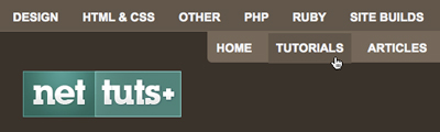
When designing a new site, web designers usually face the age-old question: vertical or horizontal navigation? There are pros and cons to both solutions. One example being horizontal navigation limits the number of links you can have due to a limited page width. This is usually solved by including a drop down system. However, if you are attempting to make your particular site stand out, you might consider thinking outside the “norm”. In this tutorial, we will be doing precisely that. We will use jQuery to create a different multi-layered horizontal navigation system that is still intuitive enough for anyone to use for the first time.
新しいサイトをデザインするとき、Webデザイナーはいつもありきたりの疑問に直面する。ナビゲーションは垂直なのか水平なのか?どちらにもいいところと悪いところがある。水平ナビだと、ページの幅にリンク数が制限される。これはドロップダウンメニューにすれば解決するが、自分の作ったサイトを他と違うものに差別化したい場合、”普通”から抜け出して考えを巡らせなければならない。 このチュートリアルでは、まさにその点について考えている。マルチレイヤーの水平ナビゲーションを実装するために、jQueryを使用している。初めてサイトにきた人にも直感的にわかるはずだ。とのことで、他にあまり例を見ないデザインになっていますね。フェードイン&アウトするのも使っていて気持ちがいいです。 角丸のパーツを作ってjQueryでアニメーションさせていく流れですが、角丸の作成には以下のサイトが紹介されていて便利そうです。 » Spiffy Corners デモとソースファイルもあるので、ぜひ見てみてはいかがでしょうか? » A Different Top Navigation もう週末だ。。がんばりましょう。今週末は楽しみだなー。