category:
Diary
Back to Blog Index
有名ブランドが定番フォントを使ったらどうなるか
「What if famous brands had regular fonts?」という記事で、有名ブランドが定番フォントを使ったらどうなるかがテストされています。 面白いのでご紹介。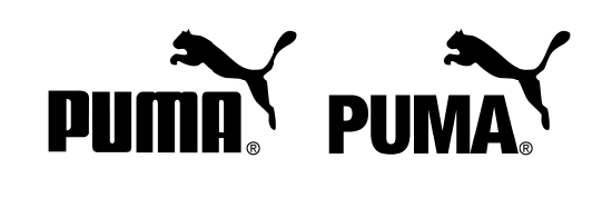 PUMAのロゴを、Helvetica Neue Condensed Blackに変更
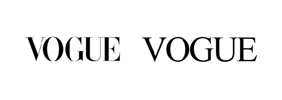 VOGUEのロゴを、 Times New Romanに変更
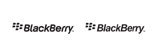 BlackBerryのロゴを、Arial Bold Italicに変更
 swatchのロゴを、Helvetica Neueに変更
HelveticaやArialは定番で歴史もあることから、逆にモダンな感じもしますね。
What if famous brands had regular fonts?
swatchのロゴを、Helvetica Neueに変更
HelveticaやArialは定番で歴史もあることから、逆にモダンな感じもしますね。
What if famous brands had regular fonts?